Writer's Perspective
The "Writer's Perspective" is a visual documentation of my childhood writings. I recreated the feelings visually using a palate mix of orange white, grey and black. Orange and white represent the happy memories while grey and back account for the sad ones. The project is a mix of non-face portraits and object photography.

RazorpayX
Corporate Card
Positioning & GTM design
Designed the corporate card experience for RazorpayX's co-branded cards turning SaaS, marketing, and cloud spend into real savings.
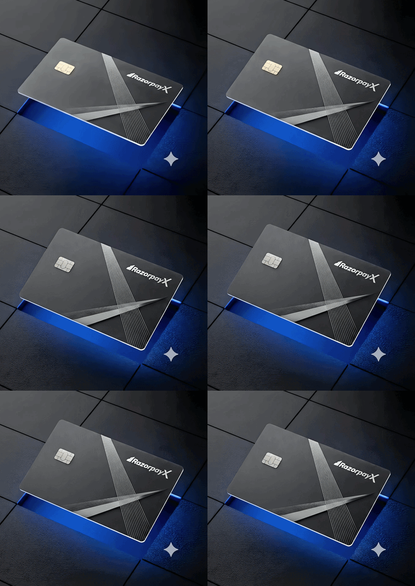
Founders were putting Google Ads and AWS bills on personal cards, so RazorpayX built one made for how startups actually spend.


Positioning the card as a savings tool, not just a spend tool
Reframing "corporate card" around cashback and cost-cutting, not just convenience
Making co-branding legible
Two bank partners (YES Bank, RBL), one RazorpayX experience, without diluting either brand
Designing for the founder's actual pain point
Reconciliation and personal-vs-business spend separation, not generic "manage your card" messaging


Reconciliation chaos from mixing personal and business spend
New entities getting rejected by traditional banks for corporate cards
Credit limits too small to match growth, straining cash flow
Cashback funding
the tools they
already use
International SaaS/cloud payments
Global payments that just work
Moment of trust 🤝

One card, all spend, clean books


Packaging Design
Designed the unboxing experience for the co branded credit card, turning a routine delivery into the first real touchpoint with the brand.


Designing one card, everywhere it shows up
The objective of this project was to design a single, consistent look for RazorpayX's Corporate Card — spanning two bank partners

Business Impact
The mission: a founder shouldn't feel like they're carrying a bank's card, they should feel like they're carrying their company's card. One consistent identity across YES Bank and RBL, so the card feels like trust, not paperwork.