Writer's Perspective
The "Writer's Perspective" is a visual documentation of my childhood writings. I recreated the feelings visually using a palate mix of orange white, grey and black. Orange and white represent the happy memories while grey and back account for the sad ones. The project is a mix of non-face portraits and object photography.

Startup Credits Program
Landing Page for Plivo's VC Partner Network
Designed and built Plivo's Startup Credits page- a dedicated landing experience where founders backed by partner VCs can claim free Plivo credits, explore the product, and get building.

More Than a Signup Form: Turning a VC partnership into a page that sells the product, not just the offer
The Startup Credits page needed to speak to four different people at once — a founder deciding whether to sign up, a developer evaluating the stack, a VC assessing portfolio risk, and someone simply skimming for proof it works. The project focused on the following steps and phases:

Mapping the Audiences
Before designing anything, the page needed a clear picture of who'd actually land on it - founders, developers, and VCs and what each one needed to see first.
Structuring the Story
The page was sequenced around a single idea - a community of founders, funds, and builders already growing on Plivo using structure, proof points, and testimonials to make that community visible and credible.
Build with Claude Code
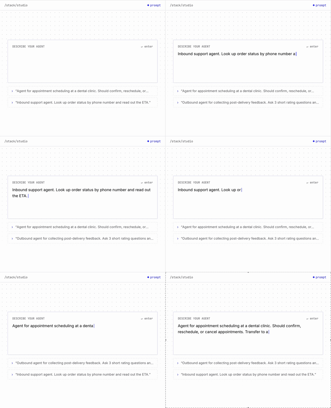
Layout, form, and content were built and iterated on directly using Claude Code, collapsing the usual design-to-development handoff into a single, faster workflow.


Planning the Build


Planned by prompting

Fed the brand system

Built and locked

Iterated until it clicked
Defined the full section structure and intent upfront, then translated that plan directly into the prompt itself
Used Plivo's existing website as a reference for type, spacing, and color, so the new page inherited the brand's visual language from the start
Worked through the page one section at a time, sharing rough Figma references and screenshots for each technical diagram
Early rounds took real back-and-forth to get right; once the pattern was established, later sections came together faster as the approach matured
A different way of building
This project wasn't about writing better prompts - it was about treating the prompt itself as the design brief, planning as precisely as you would for a Figma file, then trusting the process section by section.

Designing by prompting







Business Impact
3 days
from brief to live page
15+
VC partner funds integrated
1
Person, start to finish
The page was built to solve a real operational need fast, and it did. What typically takes a design and engineering team weeks came together in 3 days, with one person owning the process end to end, from brief to a live, functioning page.